INFLUENSTER
Reimagining the Profile Page
Influenster
Influenster
Reimagining the Profile Page
Influenster is a social platform where people can review, discuss, share photos of their favorite products. I led the design and product management of the profile page redesign.
Influenster is a social platform where people can review, discuss, share photos of their favorite products. I led the design and product management of the profile page redesign.
The Problem
Users felt the app was outdated and not intuitive. Navigation was difficult and users had no insight into people's expertise, making it difficult to foster relationships.
The Process
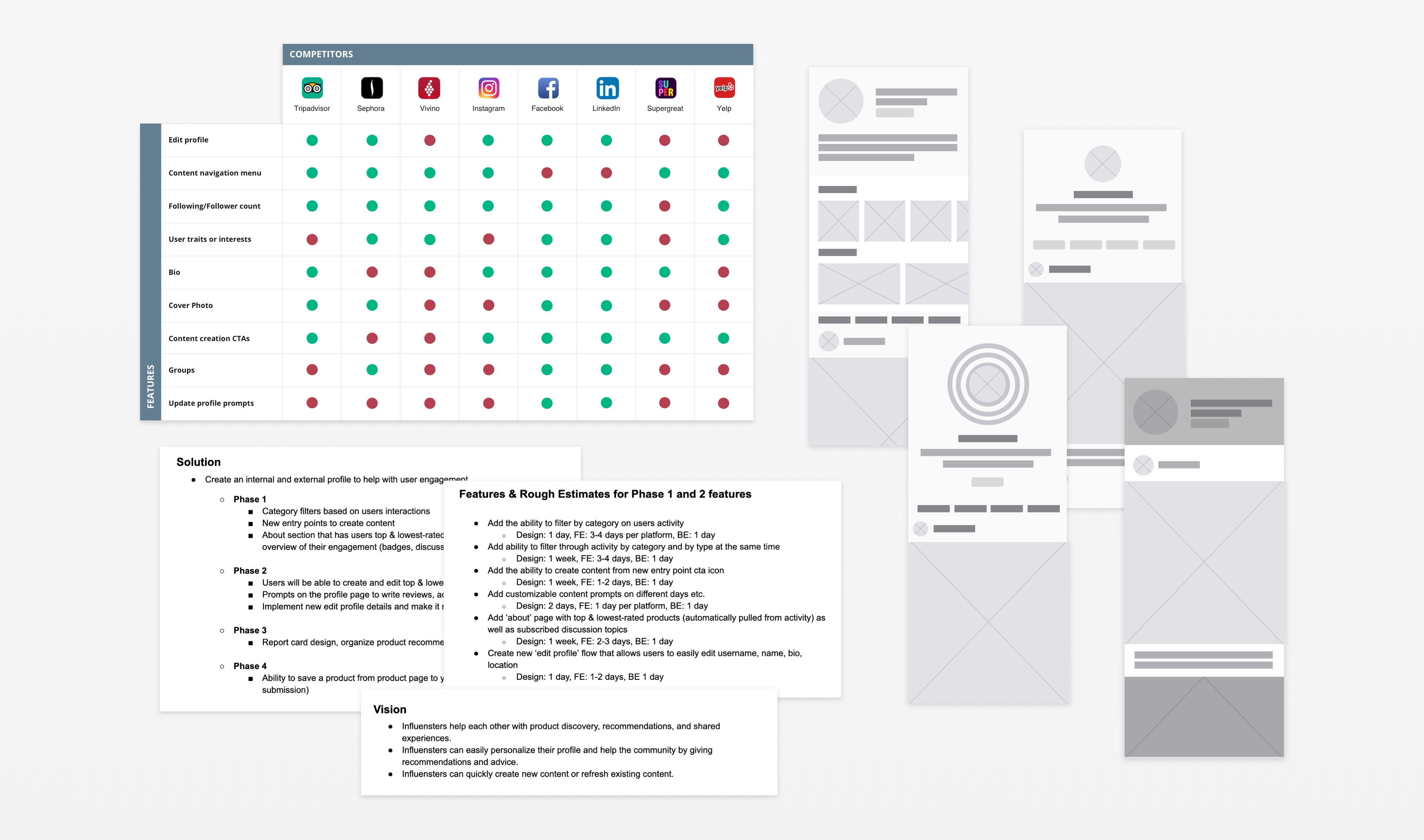
I completed a competitive analysis, prioritized user needs, met with key stakeholders to define business objectives and scoped implementation with developers.
I conducted user tests and developed designs that proved successful and met business needs. I mapped out the essential features, created the MVP and phased out future development rounds. After development, I assisted in post-release testing to ensure a flawless user experience.
Trial and Error
As requested, I sketched out unconventional designs including interactive floating bubbles. However, I ran into various limitations due to screen space and user intuition. After running user tests with a more simplified design, I moved forward with the successful design.
The Design
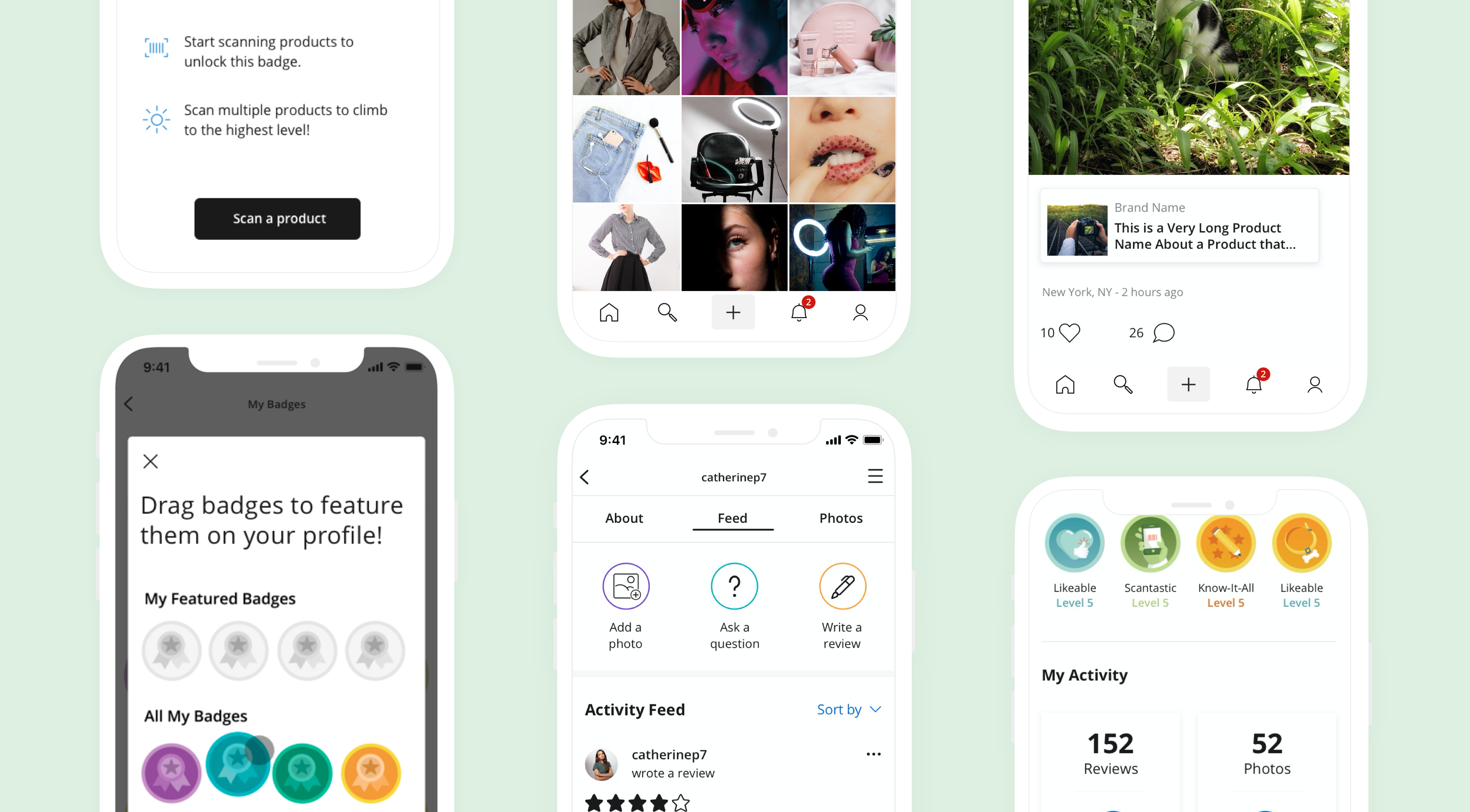
The new design is uncluttered, well-spaced, and easy to read. I introduced filters and navigational tabs to break down content easily, brought visibility into badges where users can showcase their expertise and personalize their profile, prioritized key information at the top of the page and eliminated unused features, and added more calls to action to contribute content to the platform. Review generation increased by 34% since release.
User Tests
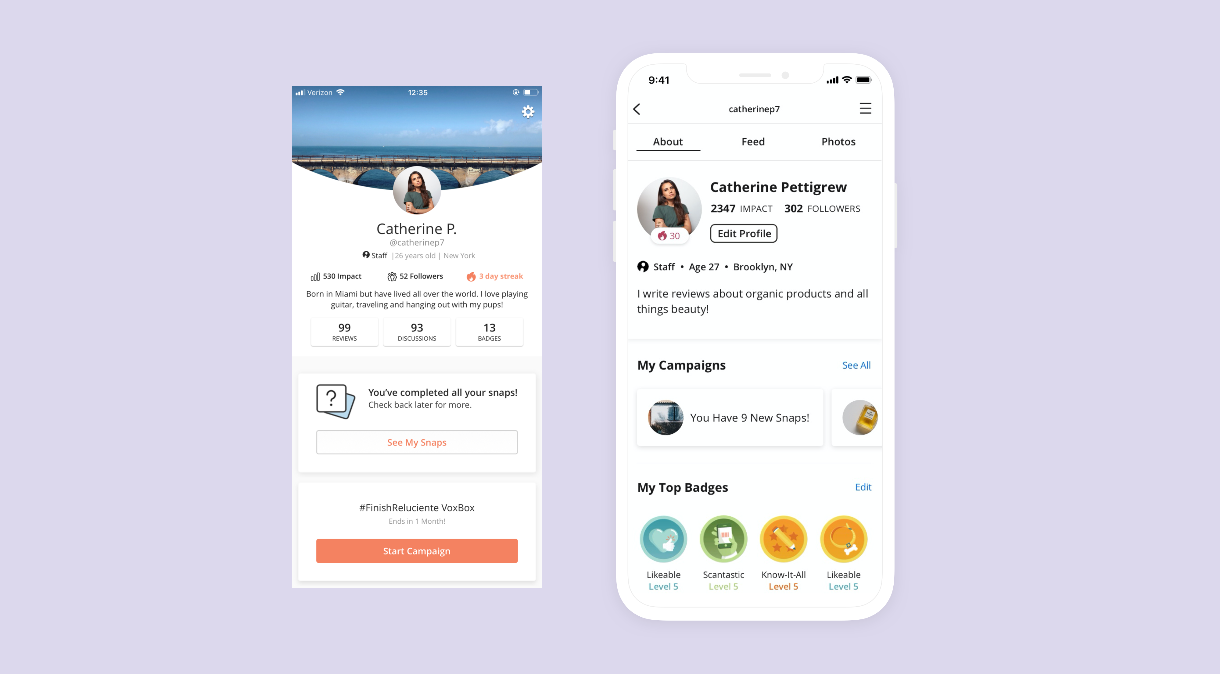
I ran a user test and had participants complete a series of tasks—first on the old design, then on the new design. Participants then expressed their thoughts on both layouts and showed more interest in the newer design.
Sample user feedback from old design: "I don’t know what to do when I land on the page.” “There is a lot to look at and I am not sure where to start.” “Um if I had to edit my profile, I think I would go to the settings but I am not entirely sure.”
In the old design, the text was not legible, there was not enough color contrast, and there was no clear navigation or information hierarchy. The new design is cleaner and addresses all of the users' needs and design concerns.
I provided more insight into expertise. Users can learn more about each other and can quickly get curated product recommendations.
Internal vs External
External vs Internal
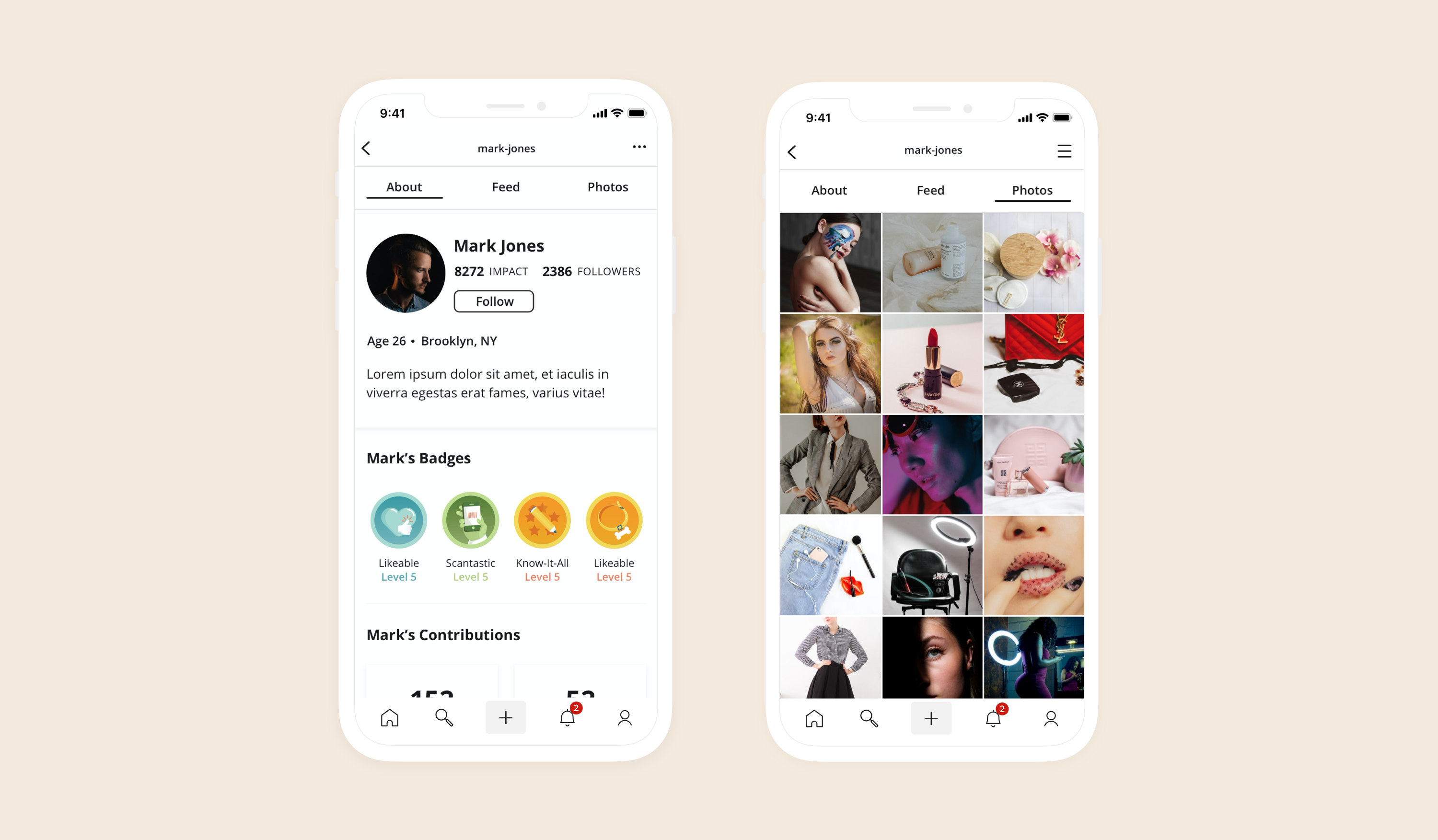
It was important to also design an external profile (i.e., how others see your profile). I made sure to hide all the personal calls to action and display only public information. On the external profile, you can easily see the user's expertise and contributions.
I introduced a photo grid design to make browsing through images easier. In the old design, users could only view one image at a time in a full-width view.
New Users
External vs Internal
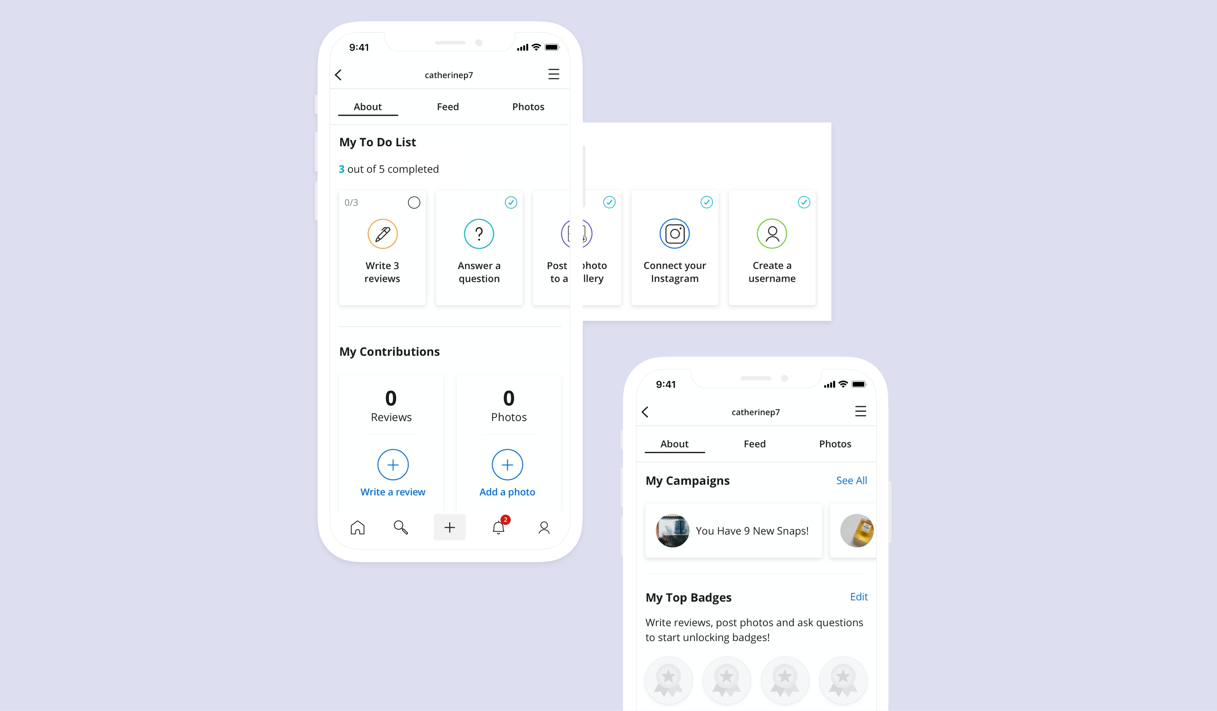
I designed screens for new users. Previously, users did not have action items to complete their profile. The new design provides users with tooltips, a to-do list that onboards them to the app, new CTAs to contribute content, and a new button providing a quick way to edit the profile.
I designed screens for new users. Previously, users did not have action items to complete their profile. The new design provides users with tooltips, a to-do list that onboards them to the app, new CTAs to contribute content, and a new button providing a quick way to edit the profile.
Challenges
I had to find a way to include UGC, valuable features that improve UX and help meet business goals, and ensure development was possible within the short time frame.
Web Updates
External vs Internal
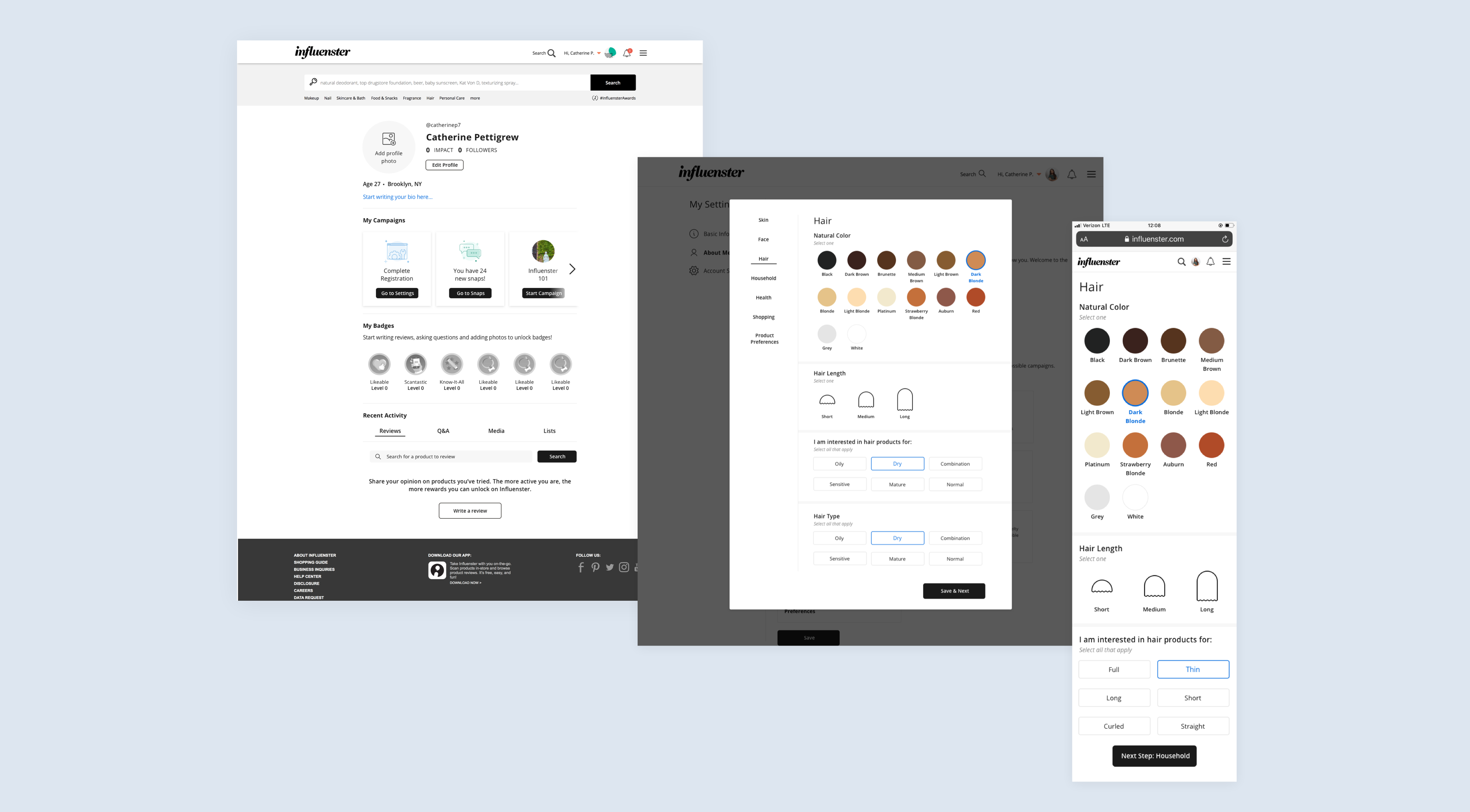
I designed the updated profile page screen for desktop and mobile, keeping key functionality, clear navigation, and visibility in profiles. This was launched at the same time as the app.
The web experience allows users to input a variety of information about themselves. I redesigned the UX and UI to match the new profile page on app.
CATHERINE PETTIGREW
CATHERINE PETTIGREW
cshpettigrew@gmail.com
cshpettigrew@gmail.com