The Problem
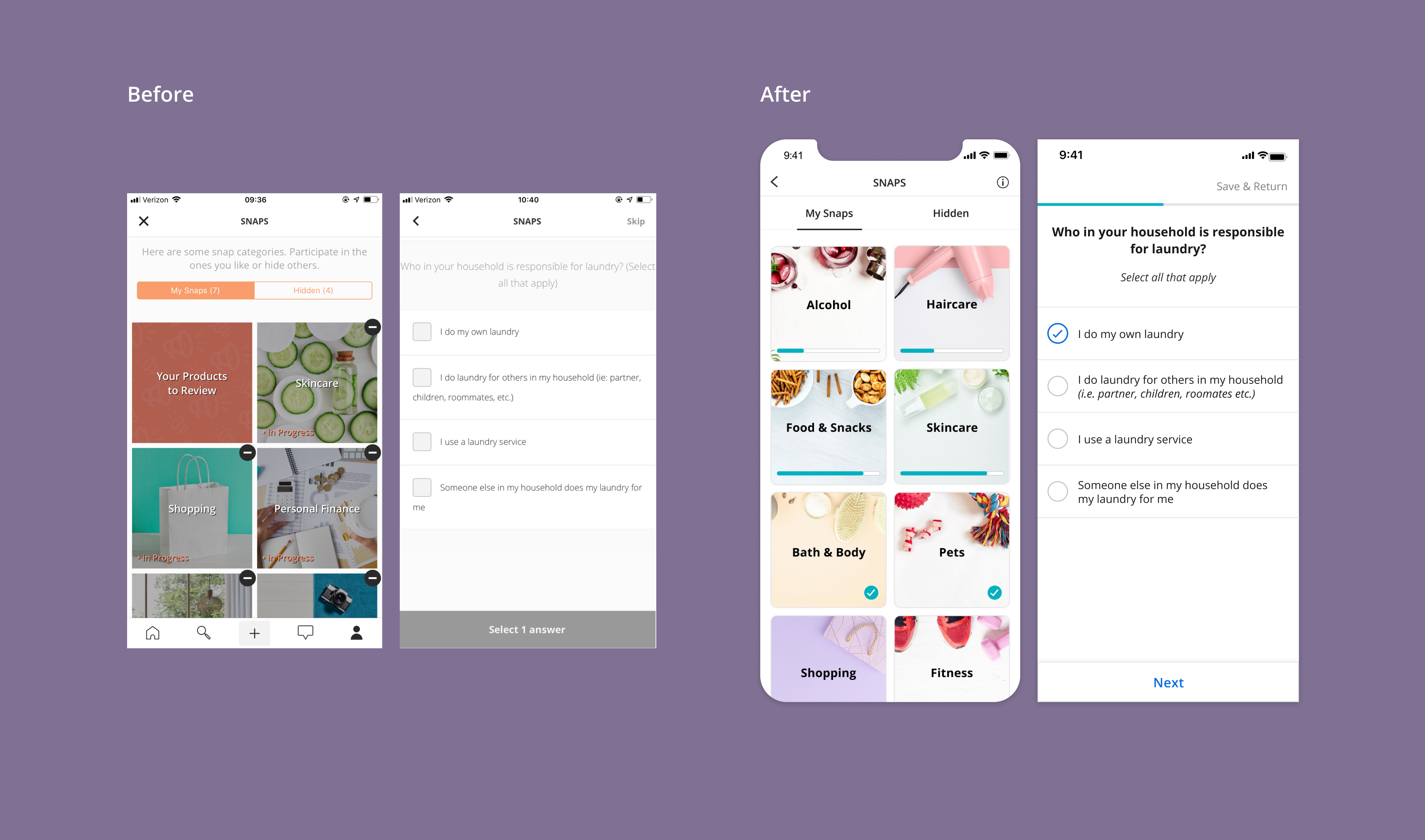
Users perceived snaps as lengthy and restrictive (they were not allowed to edit answers or go back a step) which resulted in earlier drop off and lower review numbers. New users felt confused which deterred them from starting a snap.
My Role
I worked closely with a Product Manager to uncover pain points and come up with solutions that make taking snaps an enjoyable and easy experience. We phased out the project and presented to stakeholders.
I worked closely with a Product Manager to uncover pain points and come up with solutions that make taking snaps an enjoyable and easy experience. We phased out the project and presented to stakeholders.
Goals
- Improve user engagement and decrease early drop off
- Increase review count per unique user
- Increase number of completed snaps
- Educate new users on snaps before they begin

The Solution
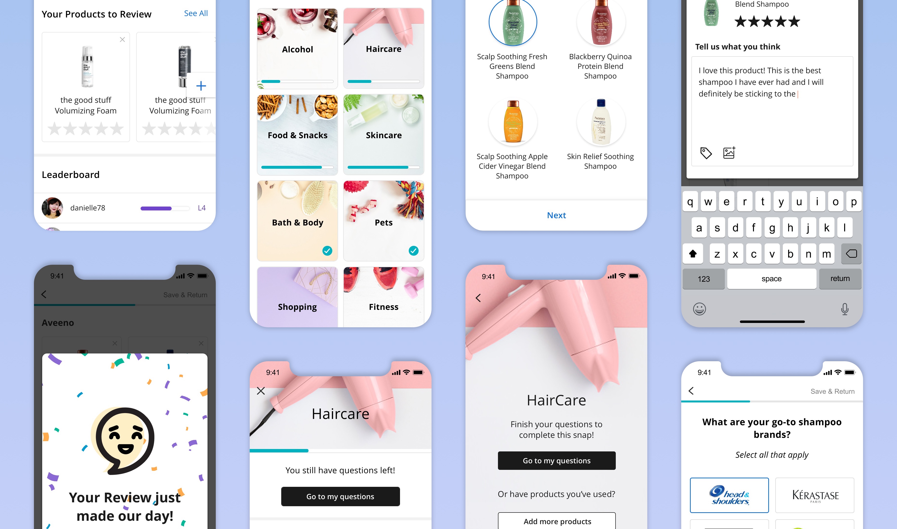
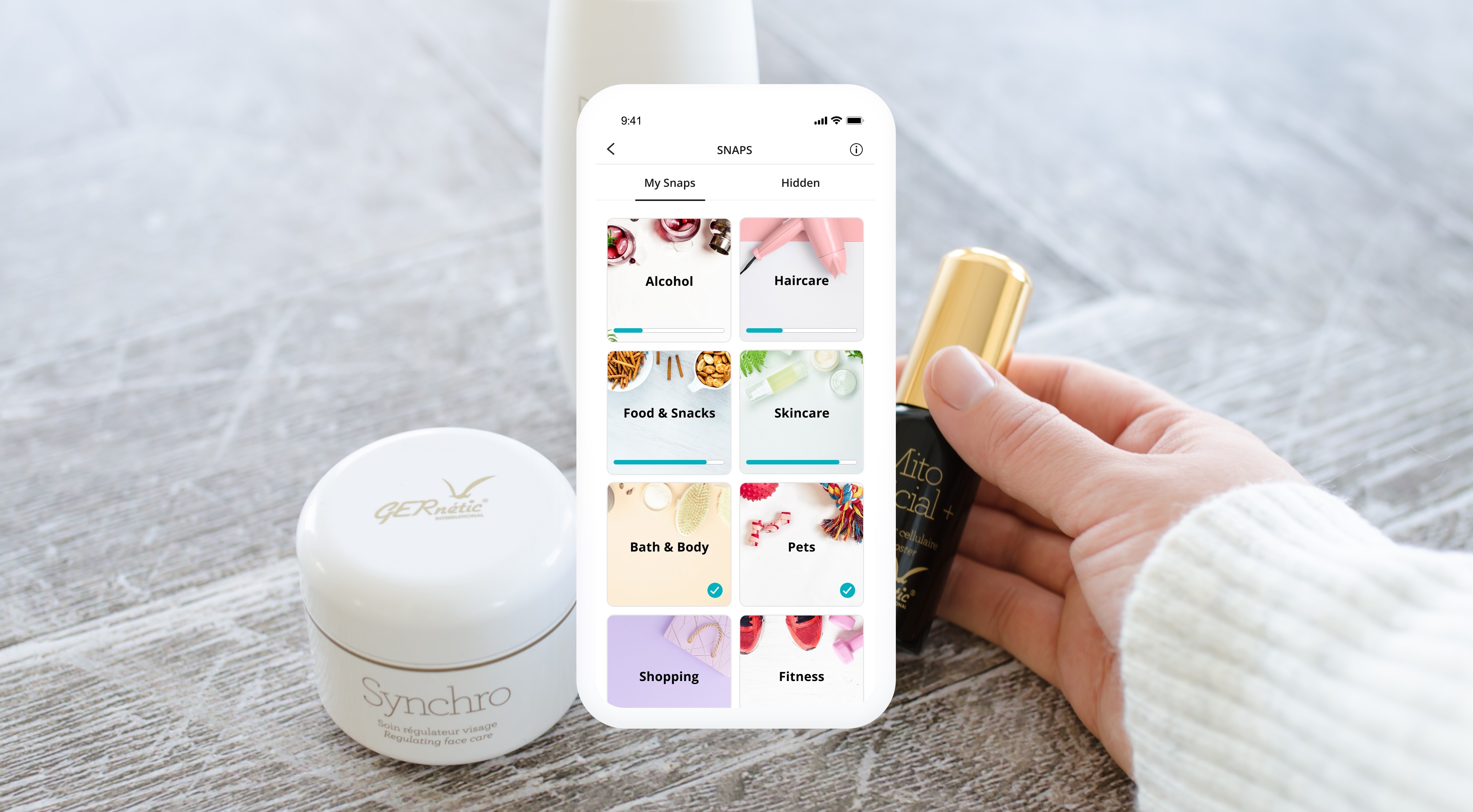
I redesigned and gamified the experience, added progress markers and gave visibility into each snaps category. I also created post review toasts and small wins as users complete questions, e.g. product recommendations and current deals.

The Design
I improved snaps visibility by creating a new screen where users can delete, view or complete their products to review.
The leaderboard allows users to view their follower's progress so they are motivated to complete the snap and move to the next level.
Prototyping
PROTOTYPING
I introduced logos to help with brand recognition and increase response time for snap questions.
We created parameters that help with progress indicators and introduced snap levels. When new snap questions are added, users will be notified to move to the next snap level.

I increased font sizes and created more visual contrast throughout the snap to make it more user friendly. I used lighter imagery that follows brand guidelines and worked with a copywriter to ease the language and shorten question length.
New Members
When users open snaps for the first time they will see the 'How To' pop up explaining the experience. Once they begin the snap they will be guided with helper text when presented with new features.
Learnings
Designing a long survey can be difficult because you need to ensure the business is collecting enough information to enhance the member experience while also ensuring the member is not feeling overwhelmed as is open to answering.
We worked closely with the analytics team as well as the sales team to review information that was necessary and designed a flexible solution that evolves with the member journey. I also designed additional context to let the member know where they are and why they will benefit from entering this flow.
CATHERINE PETTIGREW
CATHERINE PETTIGREW
cshpettigrew@gmail.com
cshpettigrew@gmail.com