The Problem
Engaging with the Influenster app and having a high 'impact score' increases your chances of receiving free products to try then review. We ran surveys and audited external discussion threads where users expressed feeling confused when entering the app, not understanding the impact score or what to do to increase product eligibility.
Imagine joining an app to get free products, then not knowing what to do to get them. The 'impact score' was a crucial part of the app experience and data was showing low user engagement.
The Process
I worked with a Product Manager and Senior Engineer to build an improved impact score system that introduced gamification. I conducted competitive and market research. After mapping out a cohesive user flow and wireframing, I worked on high fidelity designs and launched a Beta test with the Product Manager.
After running a Beta and analyzing results, we improved the designs and flow to produce the best results. We ran new tests then iterated and planned launch for 100% of users.
The Design
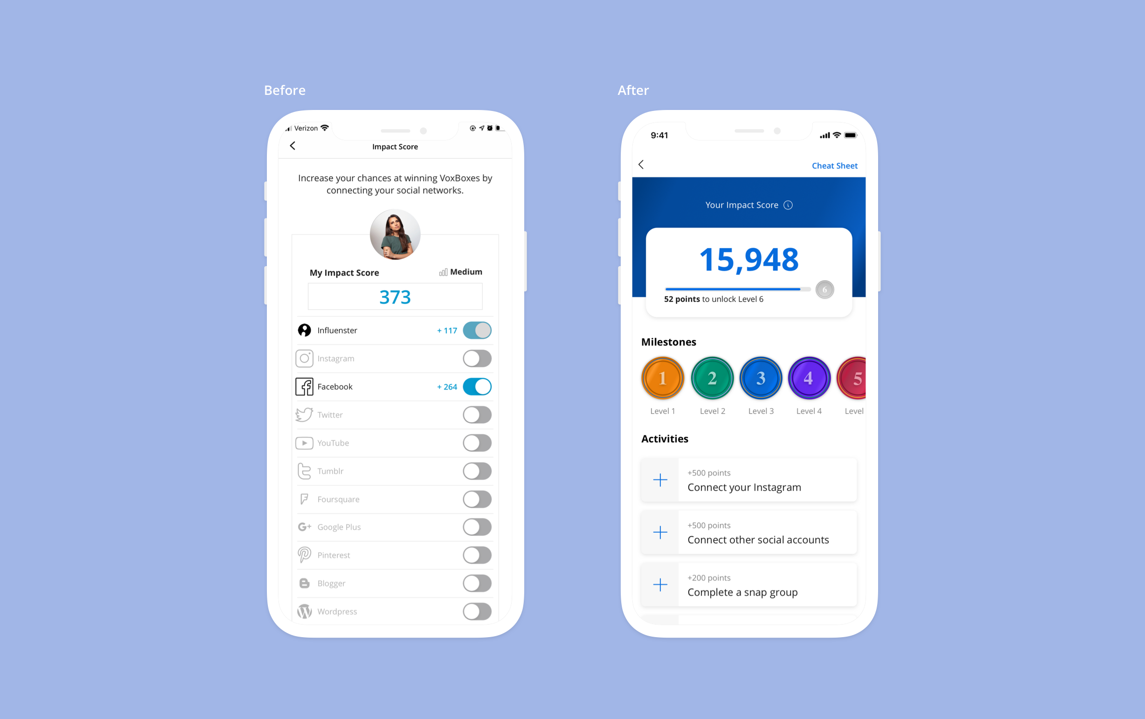
The existing impact score (left) asked the user to complete one time activities where you connect social accounts. If the user was not able to complete these activities then they could not earn impact score points. Points were determined by how many followers you had on external accounts.
A major issue is that people are hesitant to connect social accounts due to privacy concerns. Some of these social accounts do not exist anymore. Instagram also changed API structures which made it harder to collect the number of followers for points.
Wireframing & Back-End Systems
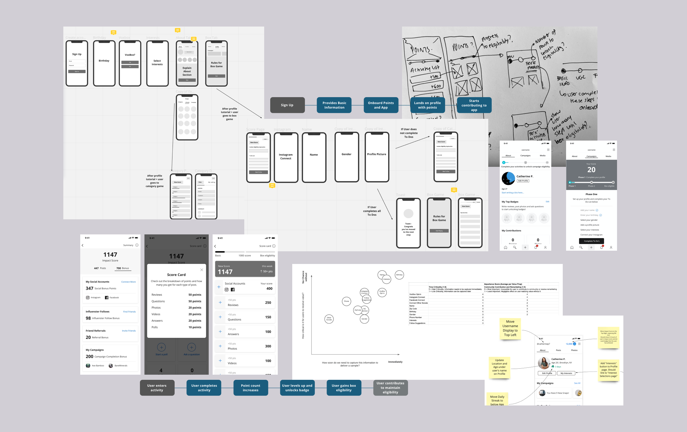
I worked with a PM, Engineer and Community Manager to come up with the best rewards system that met legal requirements. We also mapped out the most important activities and key data points we needed to collect from users. I sketched concepts, wireframed, stripped down activities and refined the user flow.
I provided more insight into expertise. Users can learn more about each other and can quickly get curated product recommendations.
We went through several rounds of design concepts with key stakeholders from product, leadership and legal. Once we agreed on a concept that worked best, I developed high fidelity designs for Beta tests.
Beta 1 Design
External vs Internal
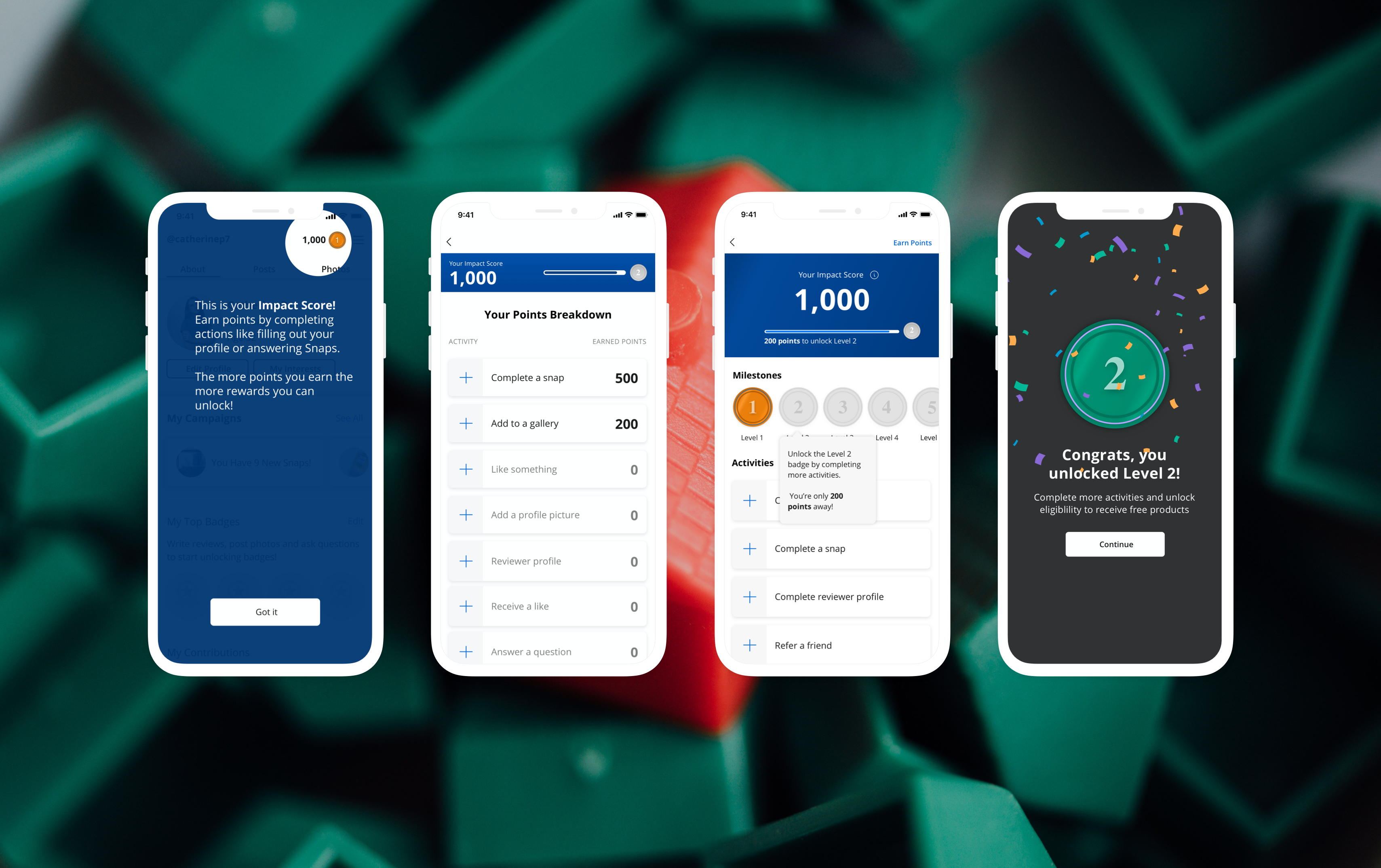
For Beta1, I kept the design minimal and easy to understand. I animated the experience before engineer hand off so we could narrow down key micro interactions and user touch points.
When developing the points system, we set it up so activities could be configured through an internal tool so that future changes to activities didn't require additional engineering hours. We could test and make real time changes to the experience.
The Beta test was launched to a small group of new users. The key screens included feature onboarding, your points breakdown where you can see completed one-time activities/ongoing activities, your points activity page and levels.
Beta 1 Results
External vs Internal
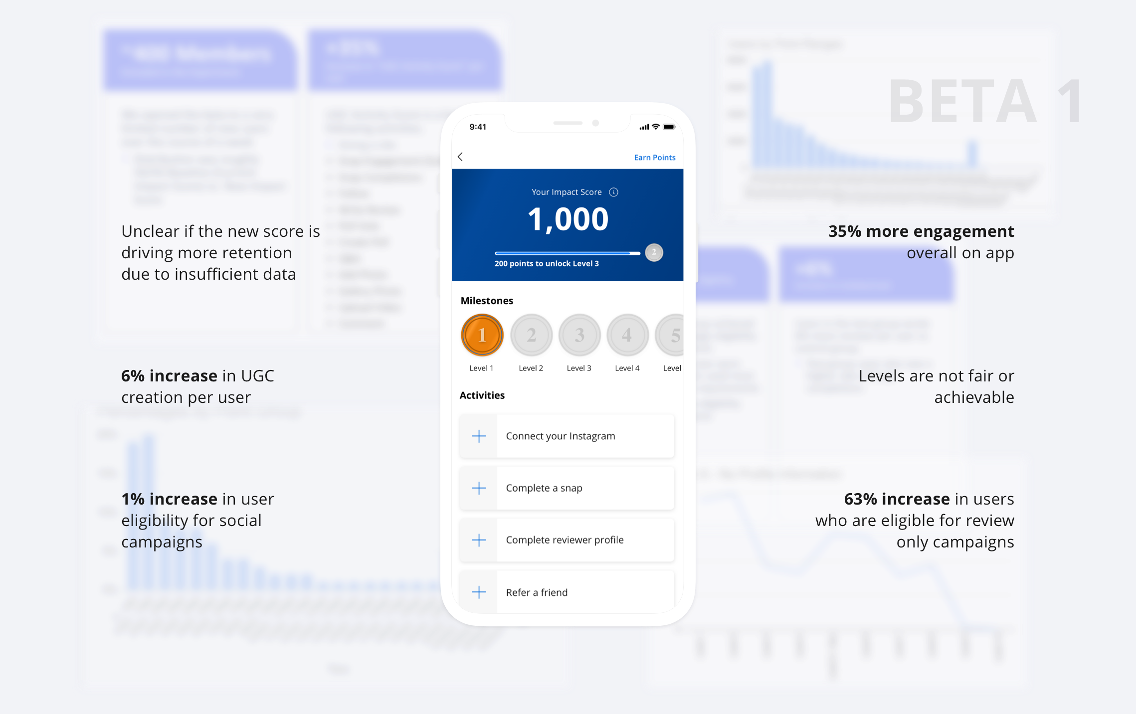
From initial results it was clear that the new system for the impact score was successful in increasing engagement and overall UGC on the app. Users also completed activities that increased their chance of receiving products for review only campaigns, and there was a slight increase in eligibility for social campaigns.
However, there were areas that didn't provide concrete data like the overall impact on long term retention. The initial experiment was launched to a small group of new users for a limited time period. For Beta 2, we increased the user pool and experiment length and improved messaging on how to get free products in onboarding.
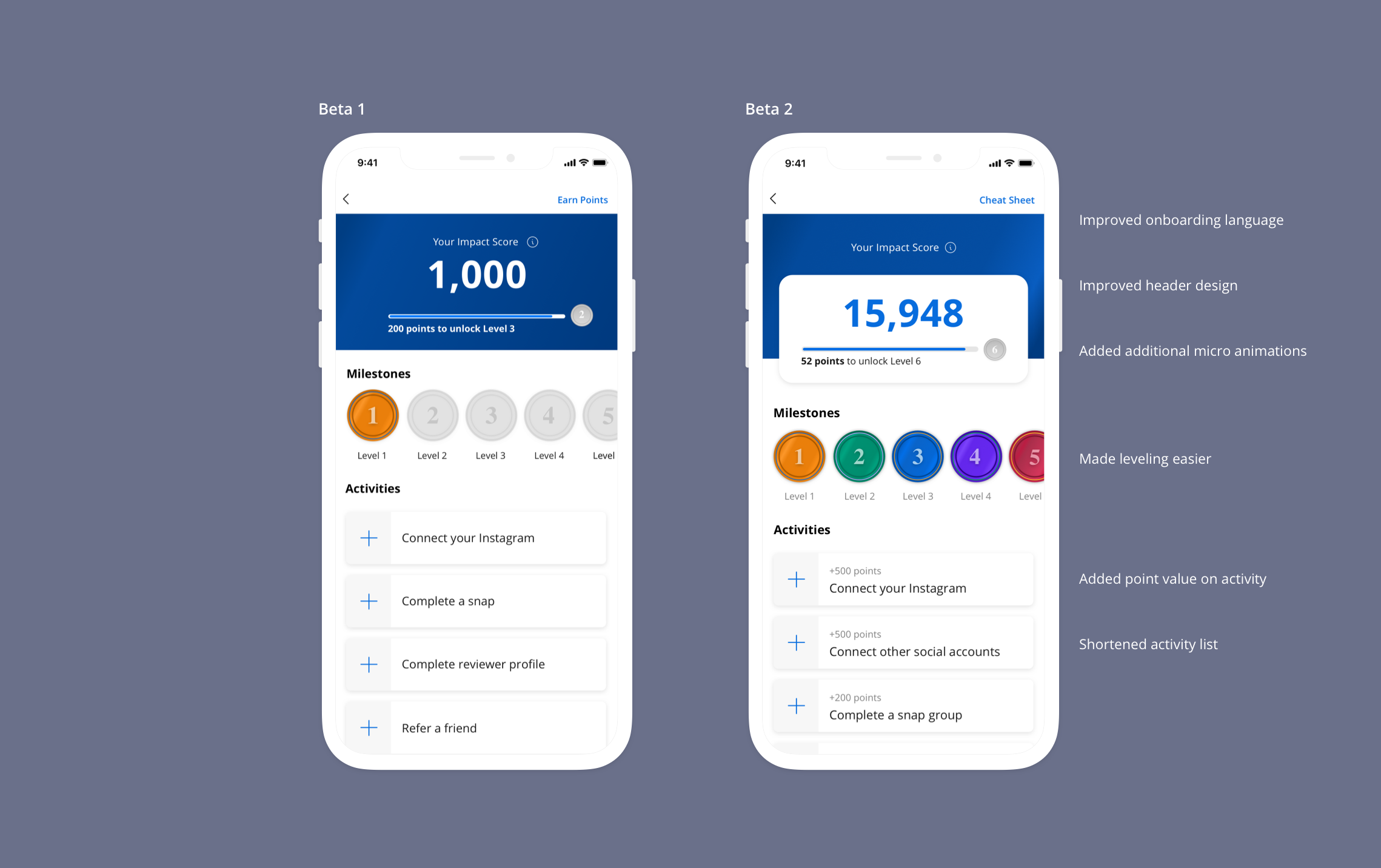
To get more eligible users for social campaigns in Beta 2, we provided more emphasis on activities that make you eligible and have shortened the overall activities list to ensure the user is focusing efforts in the right areas.
Another key aspect from these results was seeing how difficult it was to unlock levels which lead to eligibility. The intial level system was built on assumptions and analysing existing user activity however, when the Beta was launched users only made it to a low level and were stuck with low point activities to complete leading to difficulty in leveling up.
Beta & Onboarding
External vs Internal
After launching Beta 1, we realized we missed a crucial component to the experience. In app onboarding. We had mapped out how the user learns about the new points system however realized there was still a disjointed experience from when the user is onboarded to the app to when they start earning points.
The PM and I scoped out a parallel project for Onboarding that included the impact score and the journey to start earning points before launching Beta 2.
Design Tests
External vs Internal
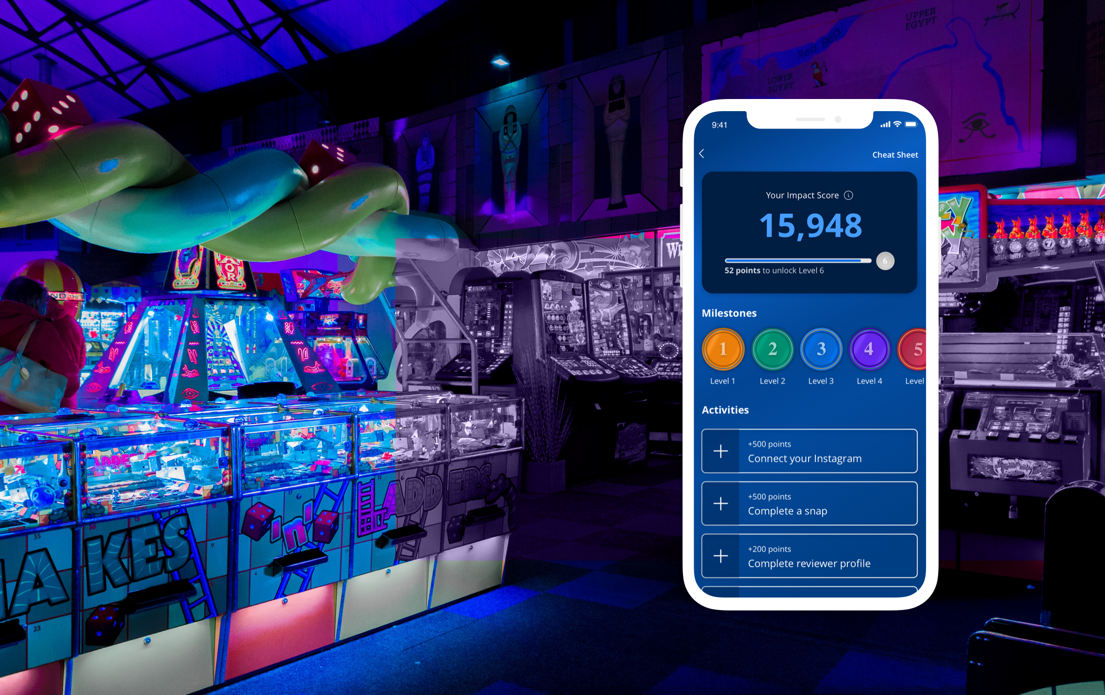
After Beta 2 results, we wanted to take the design further while keeping the same UX and working structure. I designed a very visual UI which is currently undergoing A/B tests.
The reason why I wanted to test out a new variant was that I felt the latest design was lacking a bit of the "arcade" feel. This particular area of the app is somewhere where we can push boundaries more so I adjusted the UI to make this feel more like a game.
Project Challenges
The biggest hurdles we had to overcome throughout this project was ensuring that the user has a fun experience while also making sure to meet FTC guidelines and follow legal guidance.
The platform consists of honest unbiased reviews and UGC so introducing gamification was difficult. However, after adjusting the activity list, auditing language and revising the user flow we were still able to elevate the experience and make it fun.
CATHERINE PETTIGREW
CATHERINE PETTIGREW
cshpettigrew@gmail.com
cshpettigrew@gmail.com