The Problem
We noticed a drop in daily active users and monthly active users. We also needed to increase time spent on app, content generation and review numbers.
The Process
I worked with a Product Manager to come up with ways to improve the user experience and meet KPIs. We looked at competitor apps and noticed that we were missing a social component, ways for our members to get advice, find products faster and explore.
We created lo-fi wireframes, presented to stakeholders, edited our initial ideas and phased out the project.

The Design
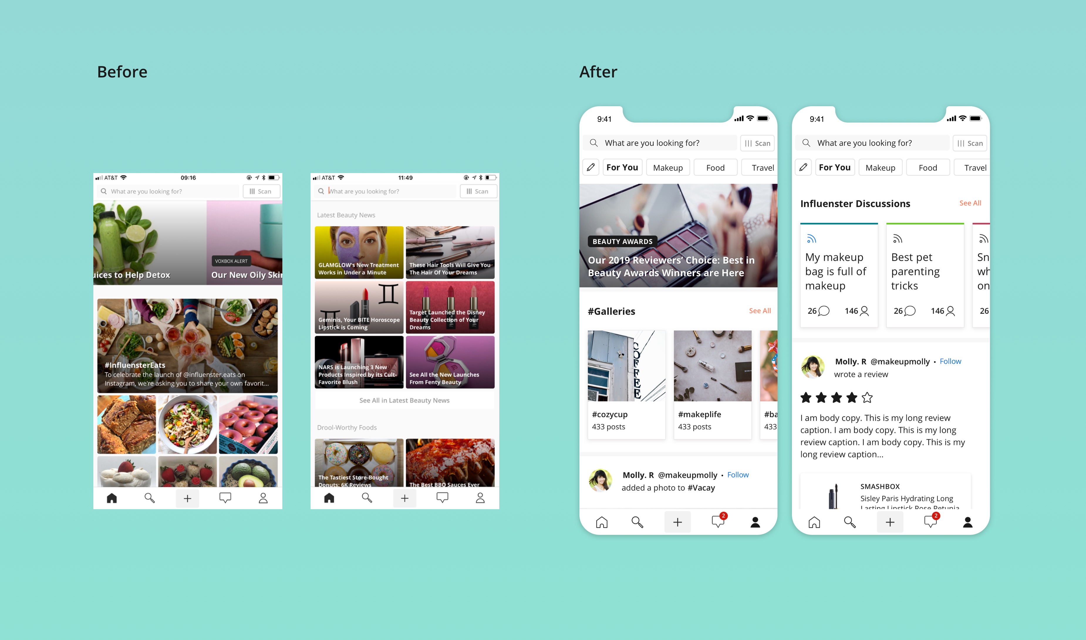
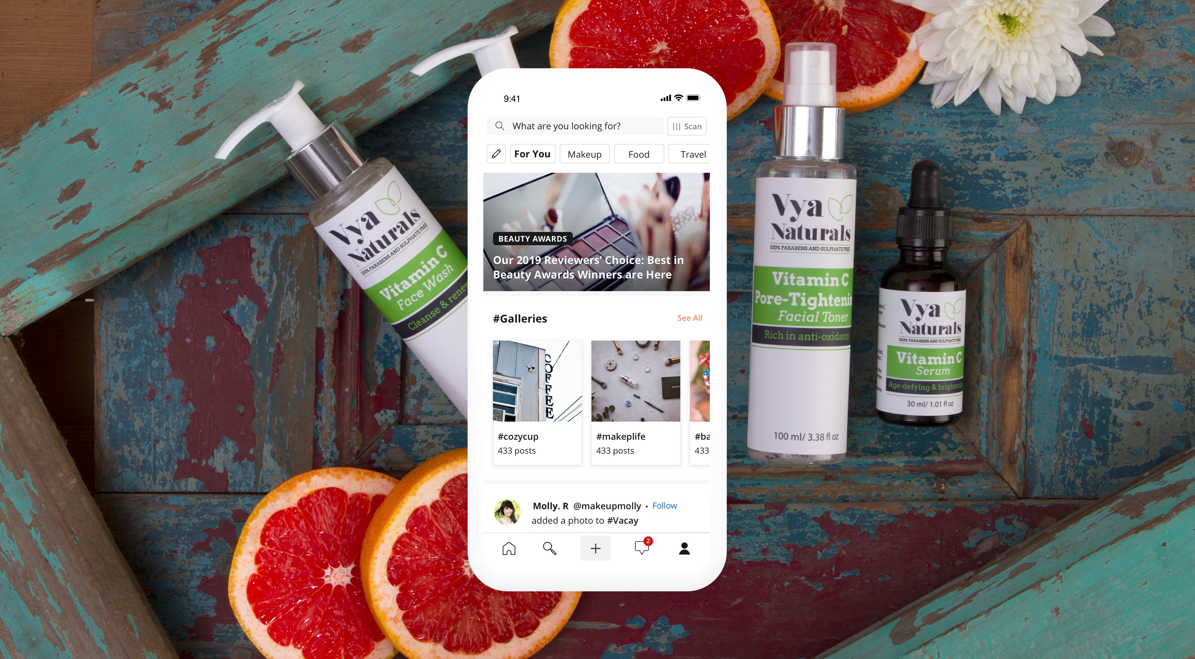
The old homepage focused on featured articles and galleries, users were lacking entry points to create content. The new design features reviews, discussions, galleries, product recommendations and q&a on a social feed.
We created several entries to create content and engage with follower content.
Personalization
After the homepage feed launched, we noticed a spike in numbers and content generation. I decided to make the experience more personalized since everyone was seeing the same feed.
I created "homepage filters" that are generated based on the users activity where users can filter content based on their interests. I was the PM and designer on this piece of the project.
I provided more insight into expertise. Users can learn more about each other and can quickly get curated product recommendations.
Personalization was a key area to finish off our social feed project. I worked with the head of product and developers to fine tune our algorithm and ensure that users were receiving relevant content.

Modular Design
External vs Internal
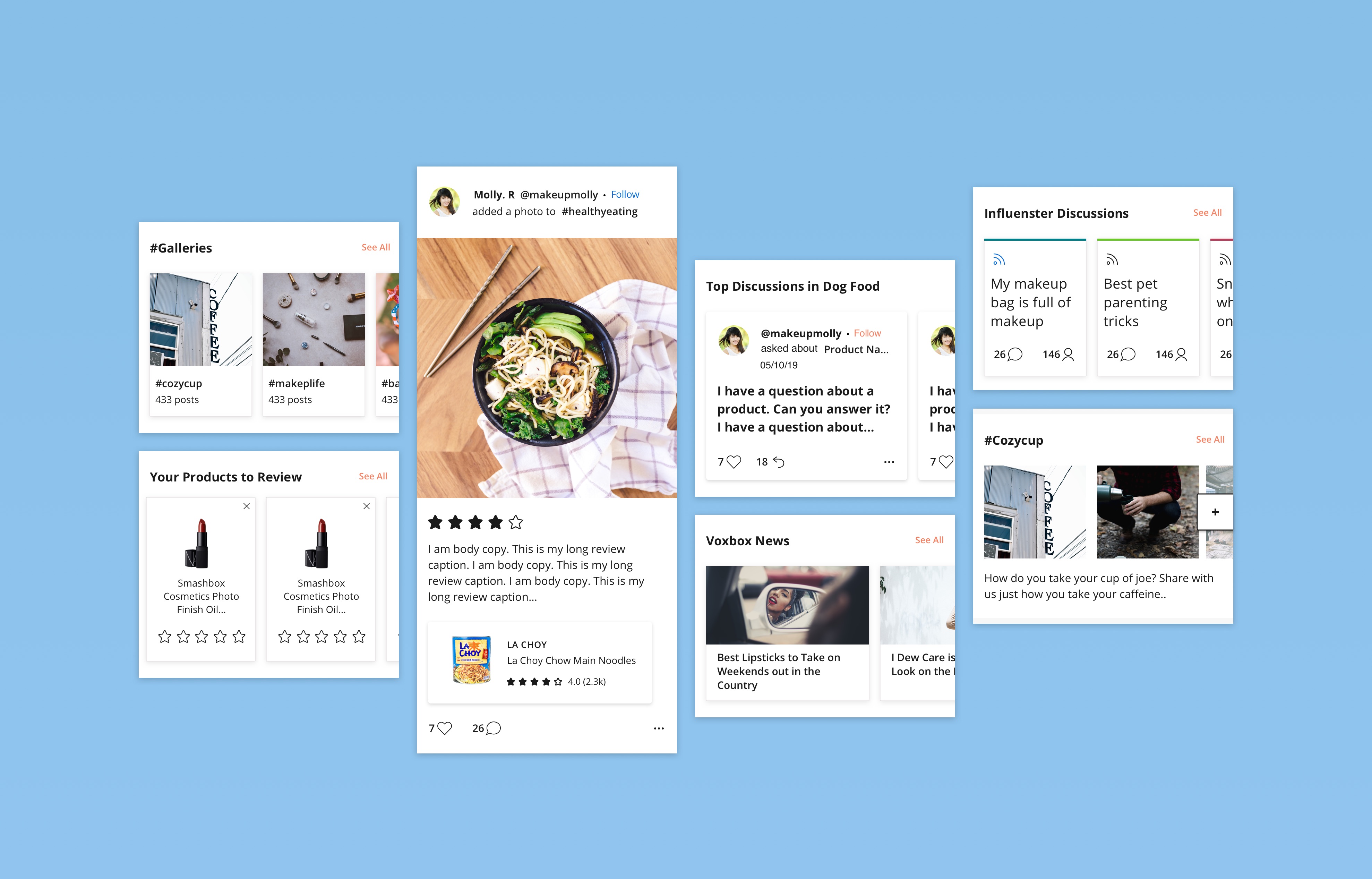
We created flexibility in the design and created a pattern for the feed. We show user generated content and modules that have personalized entry points into different areas.
The modules are spread out across the feed, allow users to access things quickly and stay engaged with fresh content. We worked with the Senior Content Manager to ensure that these modules were editable so she can freshen up or reorder content easily.

Follower Logic
External vs Internal
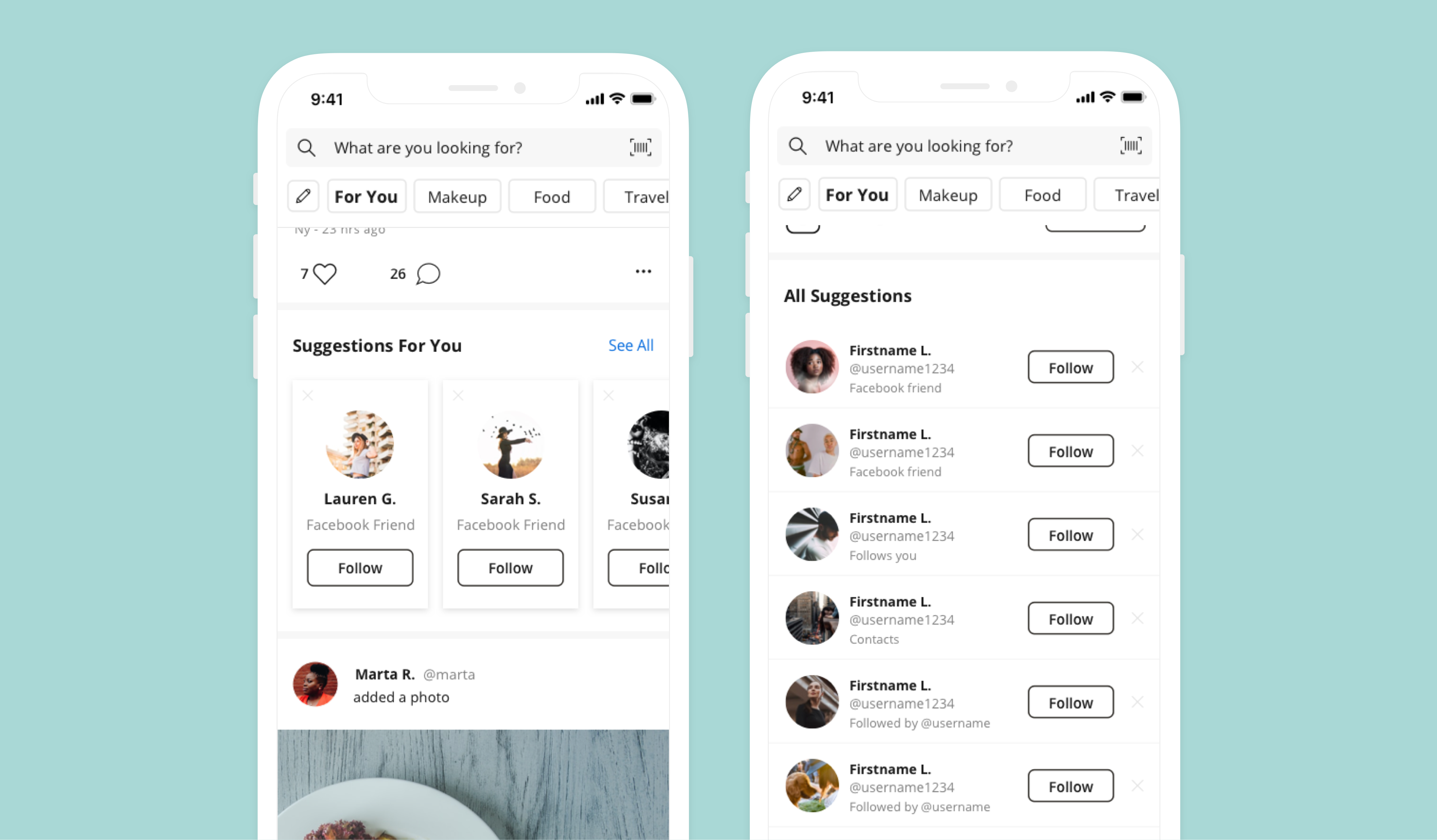
When launching the new social networking style feed, I also improved the UX of our suggested followers logic. Previously, the app suggested a random set of users to follow; however, this resulted in low follower counts. The proposed new UX ties in the users' connected social networks and contacts.
I created a structure that suggests "friends in real life" (Facebook friends or contacts) then "friends of friends" on the Influenster platform. I also added new logic that suggests users who are "experts in your interests." For example, if a user selects "Snacks" as an interest, we suggest a power user to follow who regularly posts high-quality content in that category. This is currently in the engineering stage.

Challenges
We wanted to make sure that we were showing high quality content throughout the feed. This was very challenging as there is a very high amount of content produced every hour.
We came up with content filters in the BE that help hide bad photos and spam on the feed.
CATHERINE PETTIGREW
CATHERINE PETTIGREW
cshpettigrew@gmail.com
cshpettigrew@gmail.com