My Role
When I first joined Peloton, there were multiple files containing components that were used across the board on the connected fitness (CFX) team. I was eager to create consistency and ease so I undertook additional responsibilities and became the official Design Ambassador for the CFX team.
This new set of responsibilities consisted of auditing designers files and component proposals, organizing the old design systems library as an interim fix while creating an entirely new one in the brands updated visual identity. I create structure for component implementation and I am the key point of contact for designers who have questions on the new token based library as well as how to build components.
The Process
Creating a new design systems library while also being a full time features designer on CFX meant I had to create a streamlined process, navigate priorities and communicate clearly with other designers and leadership.
I broke the product down in terms of focus areas (system, in class, browse, profile) and started off with system level components (status bars, modals, keyboards etc.,) that existed in multiple files.
I worked extremely closely with other design leads from the design systems team (app, core, ecomm and visual design) to ensure components were designed and built in the best and most consistent way possible. Through this process, I also contributed core components to the main core library that every area of design uses.
Finally, I have established relationships with engineers working on component building and have provided feedback and managed priorities for their backlog.
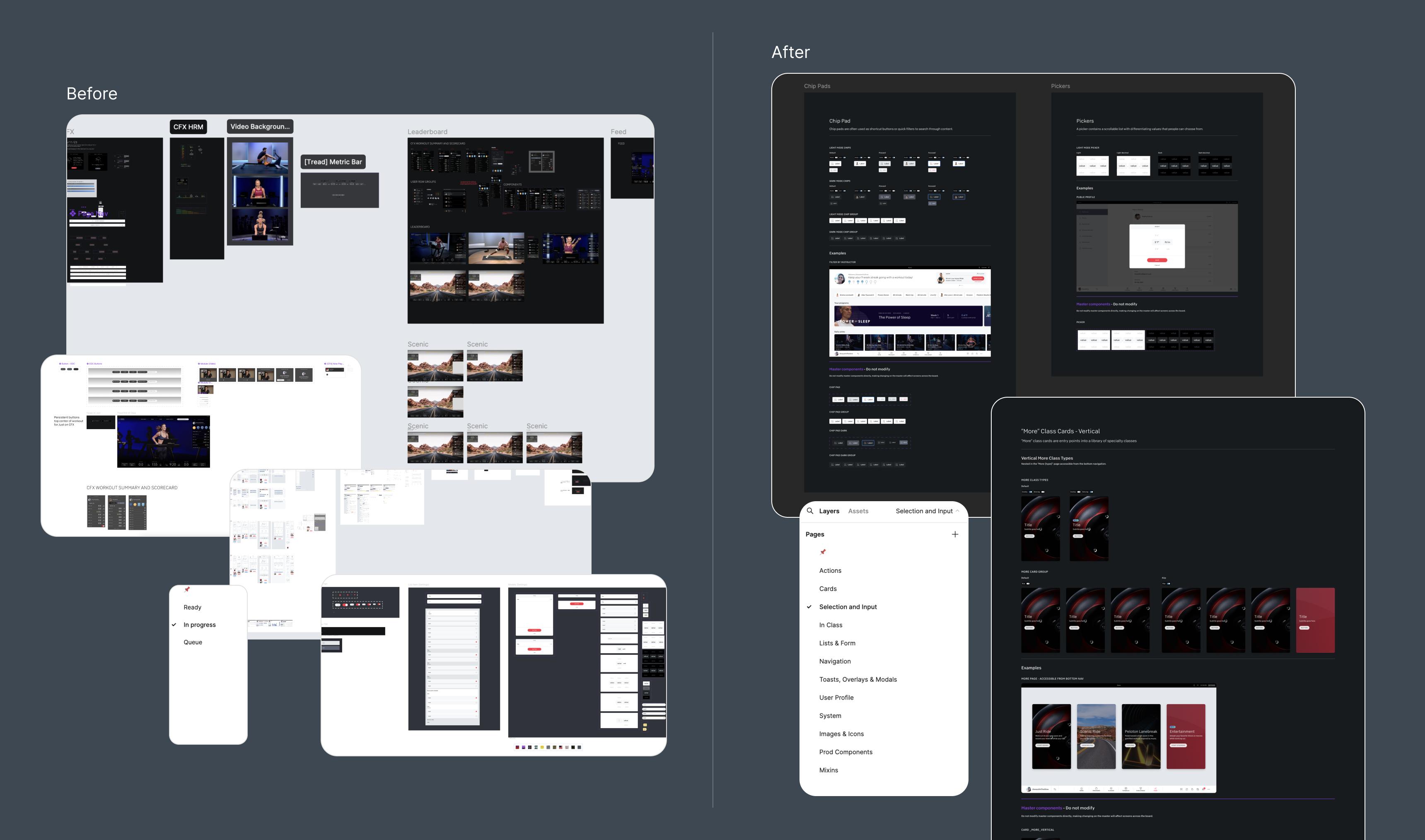
Part one: Existing systems and change
The existing library and system was cluttered with no real documentation or structure (left of image). This meant that it was very easy to use the wrong components, and created a lengthy adoption process for new designers. The library consisted of explorations from over 6 designers which meant structure, naming conventions and look and feel varied across multiple components.
Before I became the official Design Ambassador for the CFX library, I took it upon myself to organize the existing components (right of image.) I created pages, only showcased final components and added example screens for component usage.
Part two: Starting from scratch
I audited the product and listed out key components in major screens and tracked whether they existed as components or were one offs in files. I was then able to identify high priority components by collaborating with other designers and leadership.
I also worked closely with a design program manager to come up with a collaborative spreadsheet that listed out the design status, launch projects, and engineering resources that was shared across multiple teams.
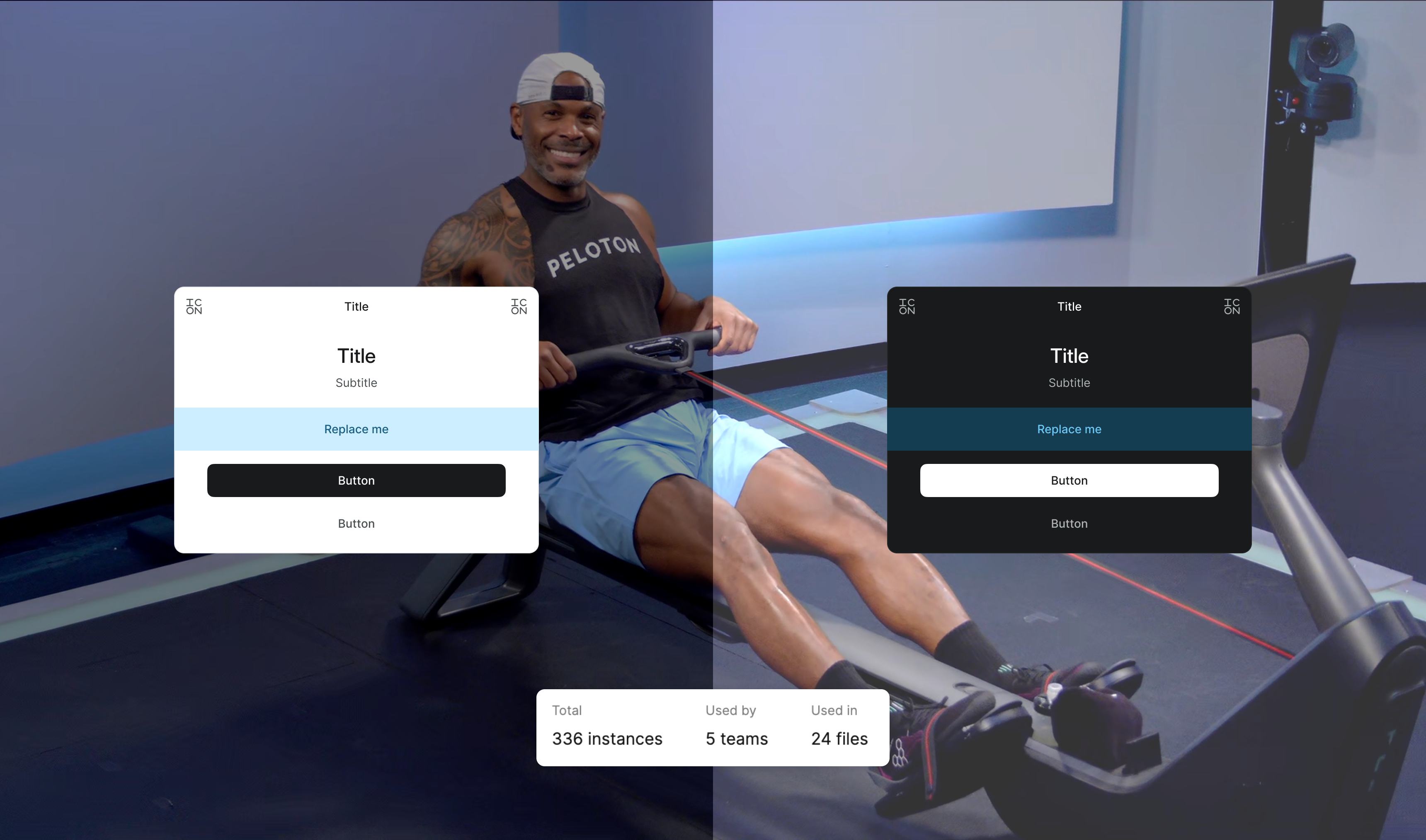
I tackled core components that affected multiple projects first and then started to build a library that used tokens and properly constructed variables. The adoption of core components was quick and in some cases had over 1,000 instances used across files.
I provided more insight into expertise. Users can learn more about each other and can quickly get curated product recommendations.
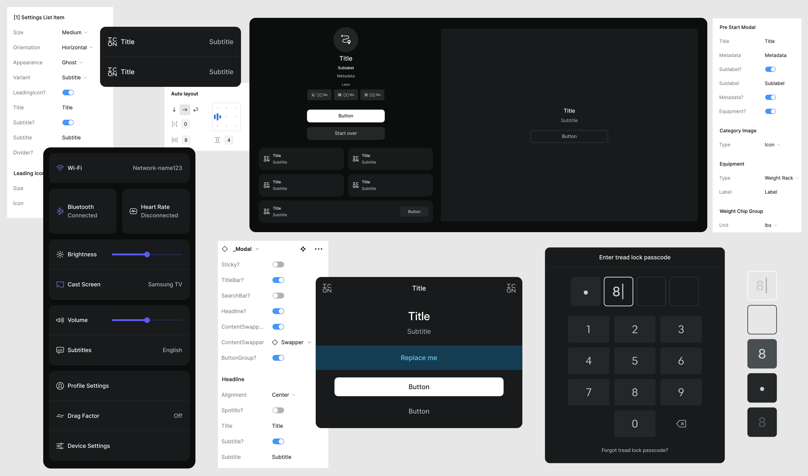
Robust components
External vs Internal
The design system is compiled with scalabel robust components that contain every configuration needed by designers. We also use 'swappers' (replace me) to provide designers with creative freedom in some components.
All of the components are attached to the Peloton variables meaning switching from light mode and dark mode is very easy.
Major Views
External vs Internal
It was important to build views for major touch points, like in class, in order to maintain consistency and be able to easily access the latest design to share with multiple teams or iterate on.
The in class view is utilized by multiple project focus areas and is made up of extremely complex components. I covered every area of in class across multiple disciplines and hardware versions.
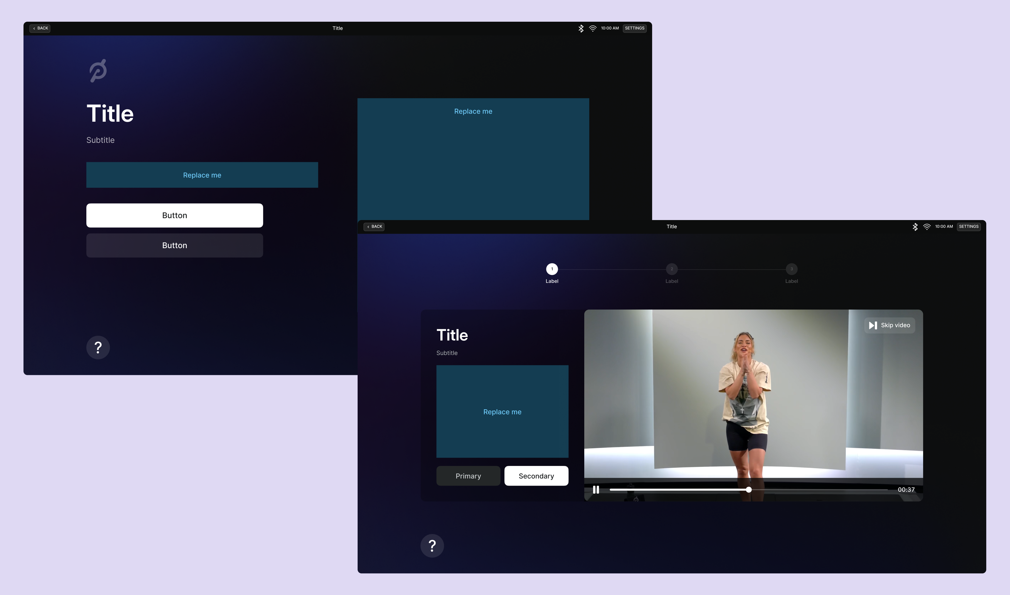
Patterns and Templates
External vs Internal
I designed page views for multiple key focus areas which includes a view with 5 layout patterns for the onboarding flow. The accessible template sped up design and implementation significantly. With increasing high priority requests coming in, I was able to design a flow that could usually take 2 hours in 20 minutes.
Challenges and the Path Forward
External vs Internal
This system is still a work in progress as my main focus at Peloton is feature design. Having limited time to build this out means it takes longer to create essential views the team needs.
However, I have created a lot of key components for CFX and now have a backlog of components for engineering. This can be challenging because we have a lack of resources to build out components meaning designers have started to version work (pre component vs post component) and have to keep a close eye in QA testing.
To remedy these challenges, I have partnered with design leadership to prioritize the order of components for a new engineering team to pick up at the end of major projects. I have also coordinated with designers who use components to add building components to the scope of upcoming launches. The path forward is clear and design consistency has already flourished.
Other Projects
CATHERINE PETTIGREW
CATHERINE PETTIGREW
cshpettigrew@gmail.com
cshpettigrew@gmail.com
