The Problem
The Problem
A local dentist in Miami realized that a large number of his patients were struggling to make appointments due to their busy schedules. The patients were hesitant to book appointments through "medical looking" apps as they appeared intimidating and lacked detailed information on dentists in their area.
The Solution
Design a playful brand and easy to use app that makes booking appointments enjoyable and quick.
GOALS
Provide users with sufficient information and reviews of each local dentist
Design a flexible booking experience
Ensure branding does not strongly resemble medical apps
- Provide users with sufficient information and reviews of each local dentist
- Design a flexible booking experience
- Ensure branding does not strongly resemble medical apps
Research
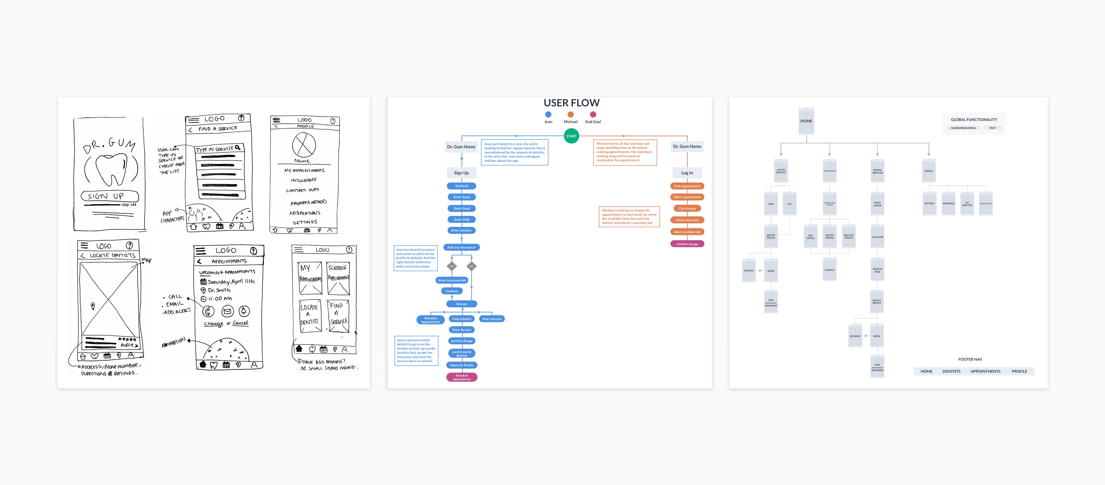
This was a fast-paced project, so I made assumptions based on Dr. Said’s customer experiences, conducted market research and completed a competitive analysis. I then sketched out rough wireframes, created two user flows, constructed the brand identity and created high fidelity prototypes for the investor proposal.
The Audience
The Skeptical Scheduler (35-60 yr old women)
The audience was based on Dr. Said’s regular patients. The Skeptical Scheduler wants an easy way to book appointments and get up front pricing whether they have insurance or not. They seek trustworthy information about each dentist and the different procedures offered. They have little free time so want to quickly find nearby dentists from anywhere.
The Design
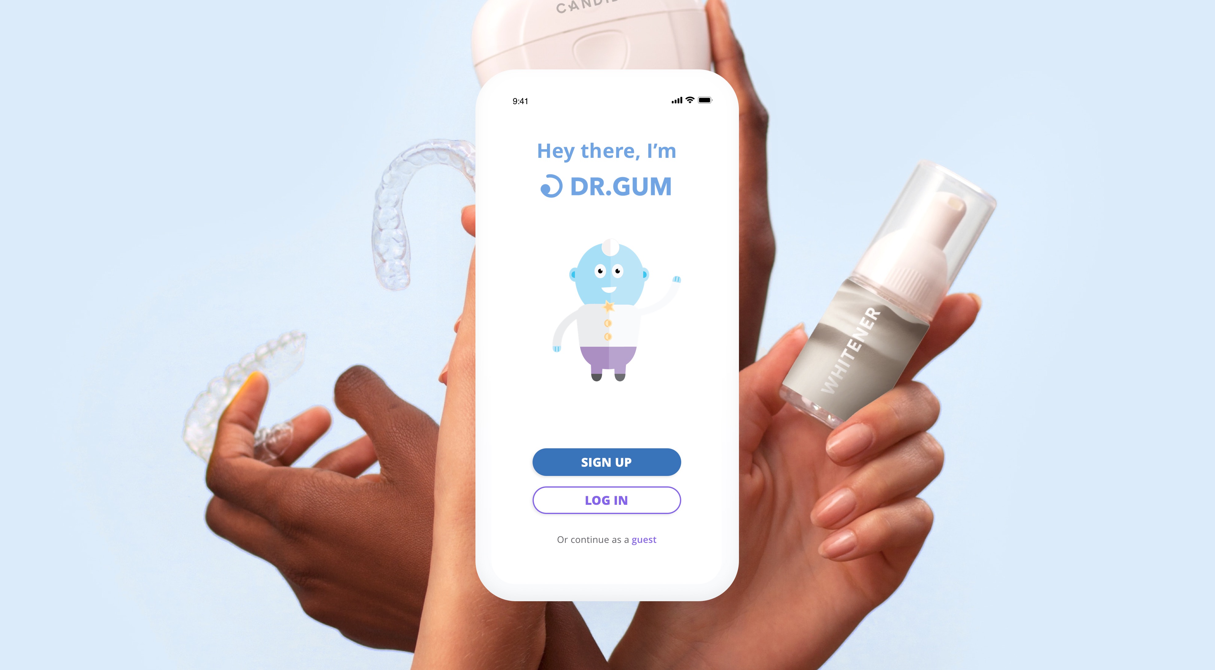
The app lets you locate nearby dentists and book an appointment with ease.
Please note, the design shown is not final as this was for an investor proposal.
Branding
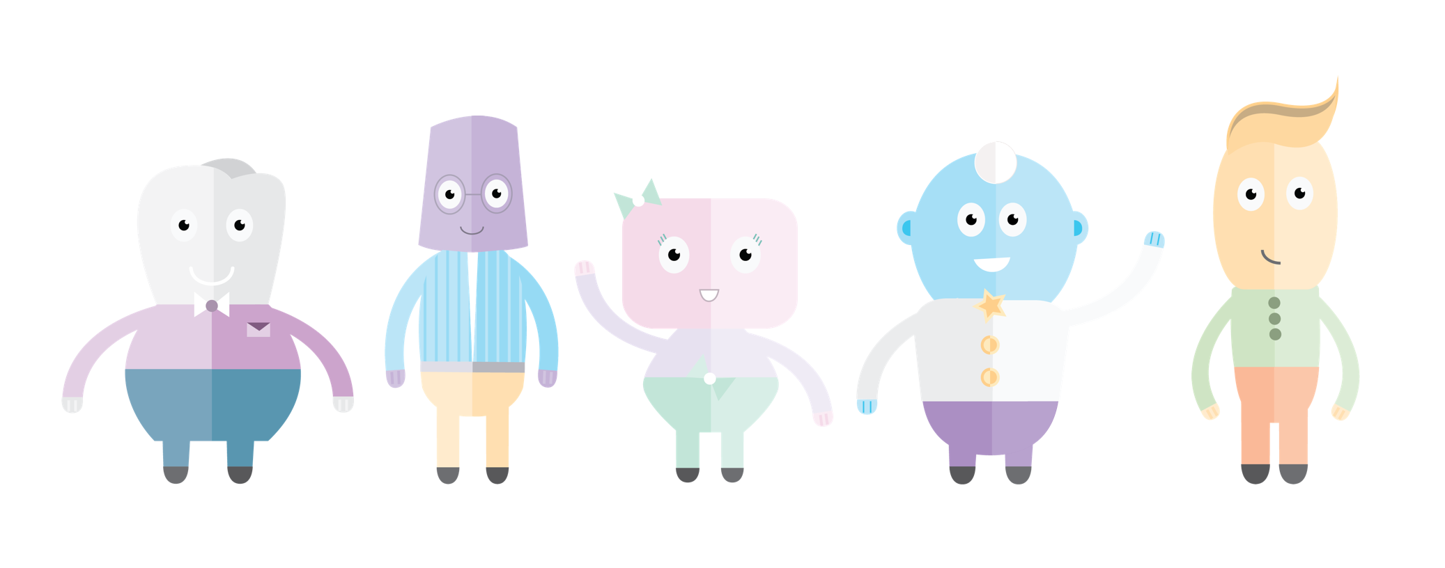
I researched color schemes that create positive experiences in the medical space and used pastel colors to brighten up the brand and maintain a calming look.
I created characters to help guide the user and make the experience more fun. My designs were inspired by dental products.
The App
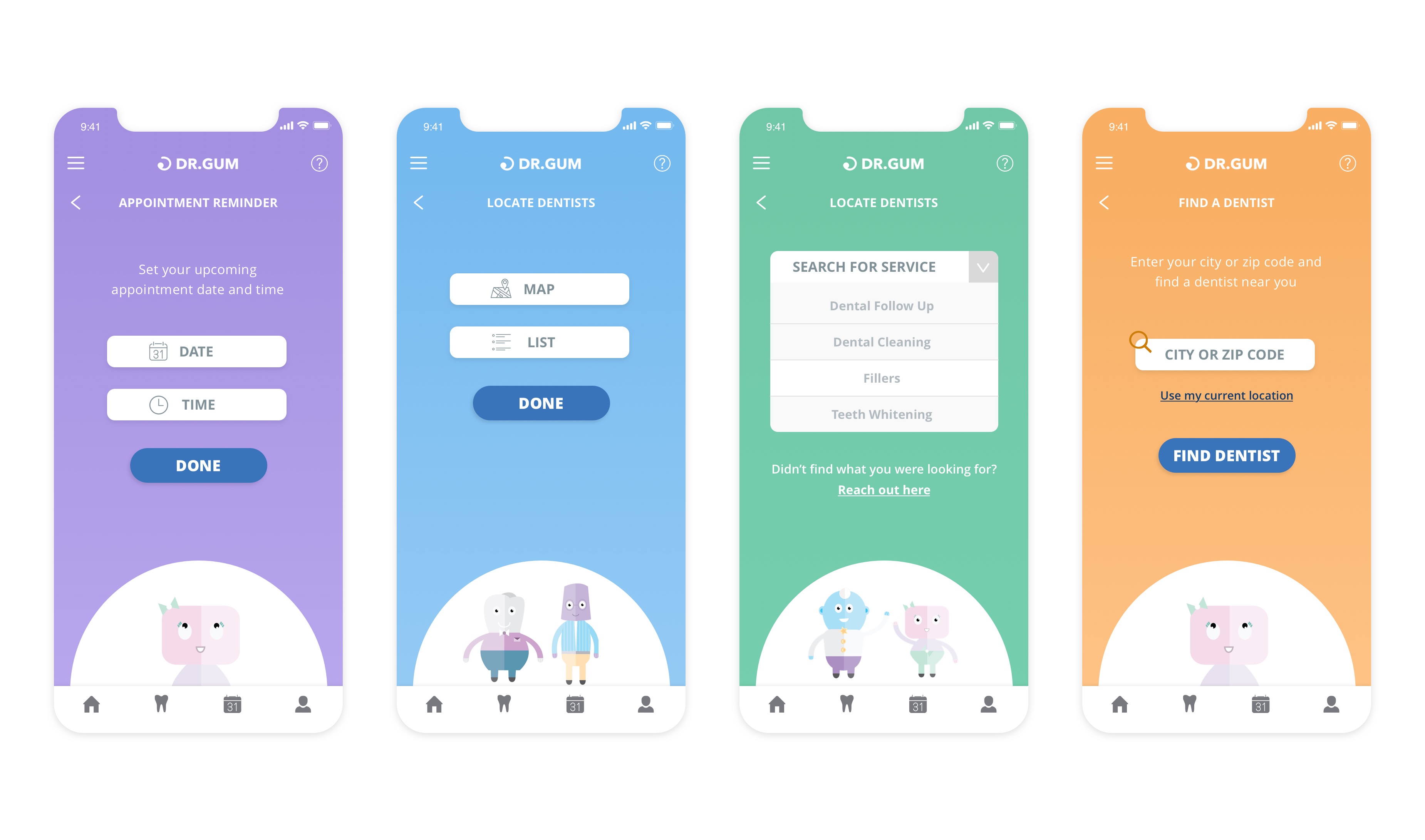
Users can search by service type or location. If they are unable to find their service type, they can fill out a custom request to get guidance when booking.
Users can locate dentists using a map view or list view and they can filter their search by entering an out of pocket price range.
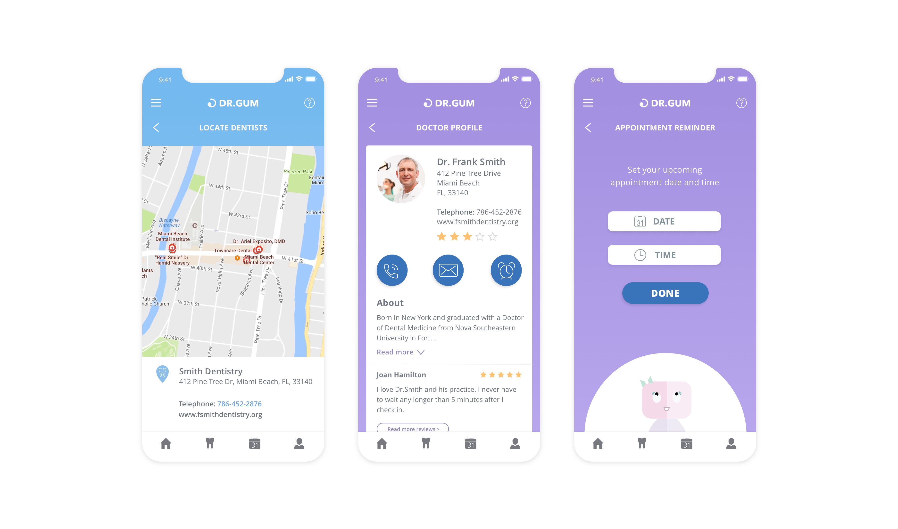
The map view will provide visual insight for dentists locations. If the user selects a practice, they will be able to find directions, see dentist details, read reviews, call the practice or visit their website.
Remembering appointments can get difficult, so the app has a built in appointment reminder. Once users complete their booking, they will be able to set a reminder or add to their calendar. Users can view or edit upcoming appointments by clicking the calendar in the bottom nav bar.
Other Projects
CATHERINE PETTIGREW
CATHERINE PETTIGREW
cshpettigrew@gmail.com
cshpettigrew@gmail.com
